
To adjust or update the CSS properties for lightning-tab in Salesforce Lightning Web Component, we can make use of Styling Hooks.
Sample Code:
Sample Lightning Web Component:
HTML:
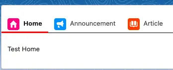
<template>
    <lightning-card class="slds-p-around_small">
        <lightning-tabset>
            <lightning-tab
				label="Home"
				icon-name="standard:home">
				<div class="slds-p-around_small">
					Test Home
				</div>
            </lightning-tab>
            <lightning-tab
				label="Announcement"
				icon-name="standard:announcement">
				<div class="slds-p-around_small">
					Test Announcement
				</div>
            </lightning-tab>
            <lightning-tab
				label="Article"
				icon-name="standard:article">
				<div class="slds-p-around_small">
					Test Article
				</div>
            </lightning-tab>
        </lightning-tabset>
    </lightning-card>
</template>
JavaScript:
import { LightningElement } from 'lwc';
export default class sampleLightningWebComponent extends LightningElement {}
CSS:
:host {
    --slds-c-tabs-item-color-border-active: red;
    --slds-c-tabs-item-color-border-hover: red;
    --slds-c-tabs-list-color-border: black;
}
JS-meta.xml:
<?xml version="1.0" encoding="UTF-8"?>
<LightningComponentBundle xmlns="http://soap.sforce.com/2006/04/metadata">
    <apiVersion>58.0</apiVersion>
    <isExposed>true</isExposed>
    <targets>
        <target>lightning__Tab</target>
    </targets>
</LightningComponentBundle>
Output:
For additional CSS properties, please check the following:
https://www.lightningdesignsystem.com/components/tabs/#Styling-Hooks-Overview