Salesforce Lightning Design System (SLDS) styling hooks make it easy to customize component styling and express your brand. Styling hooks provide CSS custom properties that correspond to SLDS component blueprints and design variations. To customize an SLDS style, declare a corresponding custom property in a component’s style sheet. You can use the custom properties to style base components and custom components.
Sample Code:
HTML:
<template>
    <lightning-card>
        <lightning-button
            variant="brand"
            label="Submit">
        </lightning-button>
    </lightning-card>
</template>
JavaScript:
import { LightningElement } from 'lwc';

export default class SampleLWC extends LightningElement {
}
CSS:
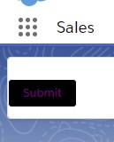
:host {
--sds-c-button-brand-color-background: black;
--sds-c-button-brand-color-border: white;
--sds-c-button-brand-text-color: purple;
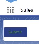
--sds-c-button-brand-text-color-hover: green;
}js-meta.xml:
<?xml version="1.0" encoding="UTF-8"?>
<LightningComponentBundle xmlns="http://soap.sforce.com/2006/04/metadata">
    <apiVersion>51.0</apiVersion>
    <isExposed>true</isExposed>
    <targets>
        <target>lightning__Tab</target>
    </targets>
</LightningComponentBundle>
Output:
When you mouse over.
For Additional hooks to customize – https://lightningdesignsystem.com/components/buttons/#Styling-Hooks-Overview
Reference Article: