Plot two numerical summaries against one another to visualize the correlation between values for a particular grouping on a report.
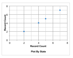
Use scatter charts to show meaningful information using one or two groups of report data plus summaries.
Cheers!!!