For PopUp using LWC, check the following code.
HTML:
<template>
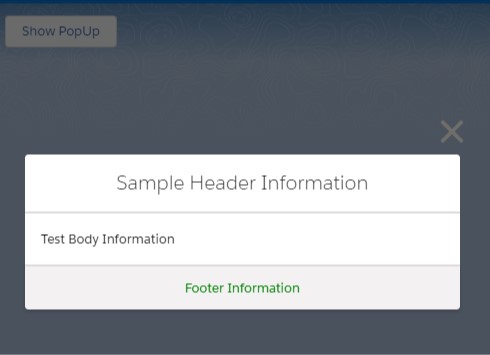
<lightning-button onclick={showPopUp} label="Show PopUp"></lightning-button>
<div style="height: 640px;" if:true={checkBool}>
<section
role="dialog"
tabindex="-1"
aria-labelledby="modal-heading-01"
aria-modal="true"
aria-describedby="modal-content-id-1"
class="slds-modal slds-fade-in-open">
<div class="slds-modal__container">
<header class="slds-modal__header">
<button
class="slds-button slds-button_icon slds-modal__close slds-button_icon-inverse"
title="Close"
onclick={closeModal}>
<lightning-icon
icon-name="utility:close"
size="medium">
</lightning-icon>
<span class="slds-assistive-text">Close</span>
</button>
<h2
id="modal-heading-01"
class="slds-text-heading_medium slds-hyphenate">
Header Information
</h2>
</header>
<div class="slds-modal__content slds-p-around_medium" id="modal-content-id-1">
Test Body Information
</div>
<footer class="slds-modal__footer">
<center><h1 style="color:green;">Footer Information</h1></center>
</footer>
</div>
</section>
<div class="slds-backdrop slds-backdrop_open"></div>
</div>
</template>JavaScript:
import { LightningElement } from 'lwc';

export default class Example extends LightningElement {

    checkBool = false;

    showPopUp(){

        this.checkBool = true;

    }

    closeModal() {

        this.checkBool = false;

    }

}
JavaScript-meta.xml:(For using the LWC as a Tab)
<?xml version="1.0" encoding="UTF-8"?>
<LightningComponentBundle xmlns="http://soap.sforce.com/2006/04/metadata">
    <apiVersion>59.0</apiVersion>
    <isExposed>true</isExposed>
    <targets>
        <target>lightning__Tab</target>
    </targets>
</LightningComponentBundle>
Output: