Sample Code:
Component:
<aura:component implements="force:appHostable">

    <aura:attribute name="activeSections" type="List" default="['a']" />
    <aura:attribute name="activeSectionsMessage" type="String" default="" />

    <div class="slds-box slds-theme_default">

        <p>{! v.activeSectionsMessage }</p>

        <lightning:accordion allowMultipleSectionsOpen="true"
                             onsectiontoggle="{! c.handleSectionToggle }"
                             activeSectionName="{! v.activeSections }">

            <lightning:accordionSection name="a" label="Section A">

                <aura:set attribute="body">

                    This is section A.

                </aura:set>

            </lightning:accordionSection>

            <lightning:accordionSection name="b" label="Section B">

                    This is section B.

            </lightning:accordionSection>

            <lightning:accordionSection name="c" label="Section C">

                    This is section C.

            </lightning:accordionSection>

        </lightning:accordion>

    </div>

</aura:component>
Component Controller:
({
handleSectionToggle: function ( cmp, event ) {
var openSections = event.getParam('openSections');
if ( openSections.length === 0 )
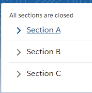
cmp.set('v.activeSectionsMessage', "All sections are closed");
else
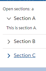
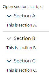
cmp.set('v.activeSectionsMessage', "Open sections: " + openSections.join(', '));
}
}) Output:
All Sections Open:
All Sections Closed: