1. Open the report.
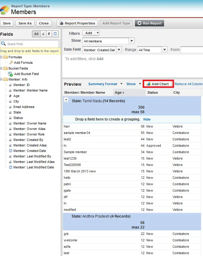
2. Click “Customize” button to edit the Report.
3. Click “Add Chart” button.
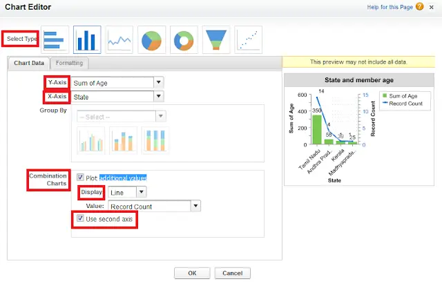
4. Select Chart type.
5. Select X-axis.
6. Select Y- axis.
7. Check “Plot additional values” check box in Combination Charts for additional field to plot in the chart.
8. Select Line or Column in Display.
9. When adding a line to a vertical
column chart, select Use second axis to show
a separate axis for the added line on the right side of the column
chart. A separate axis can be useful when the two values have different
ranges or units.
10. If it is “Column”, we can add multiple columns.

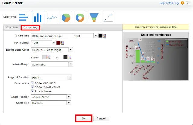
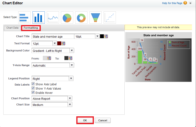
11. Click formatting to decorate your Chart.
12. Click “Ok” button.
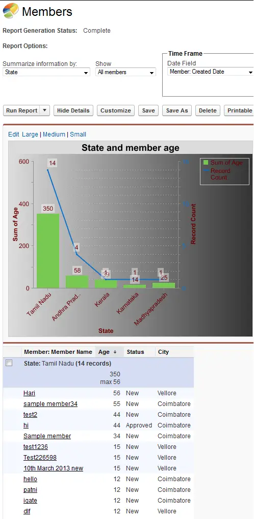
Sample Chart: